|
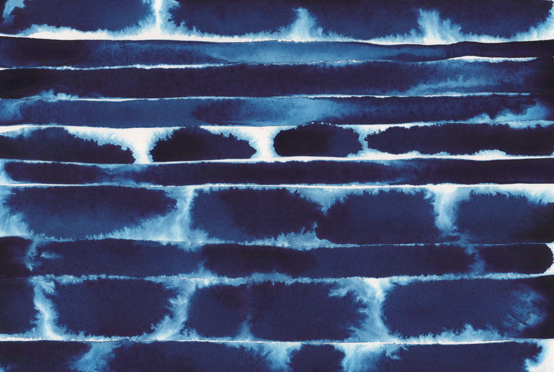
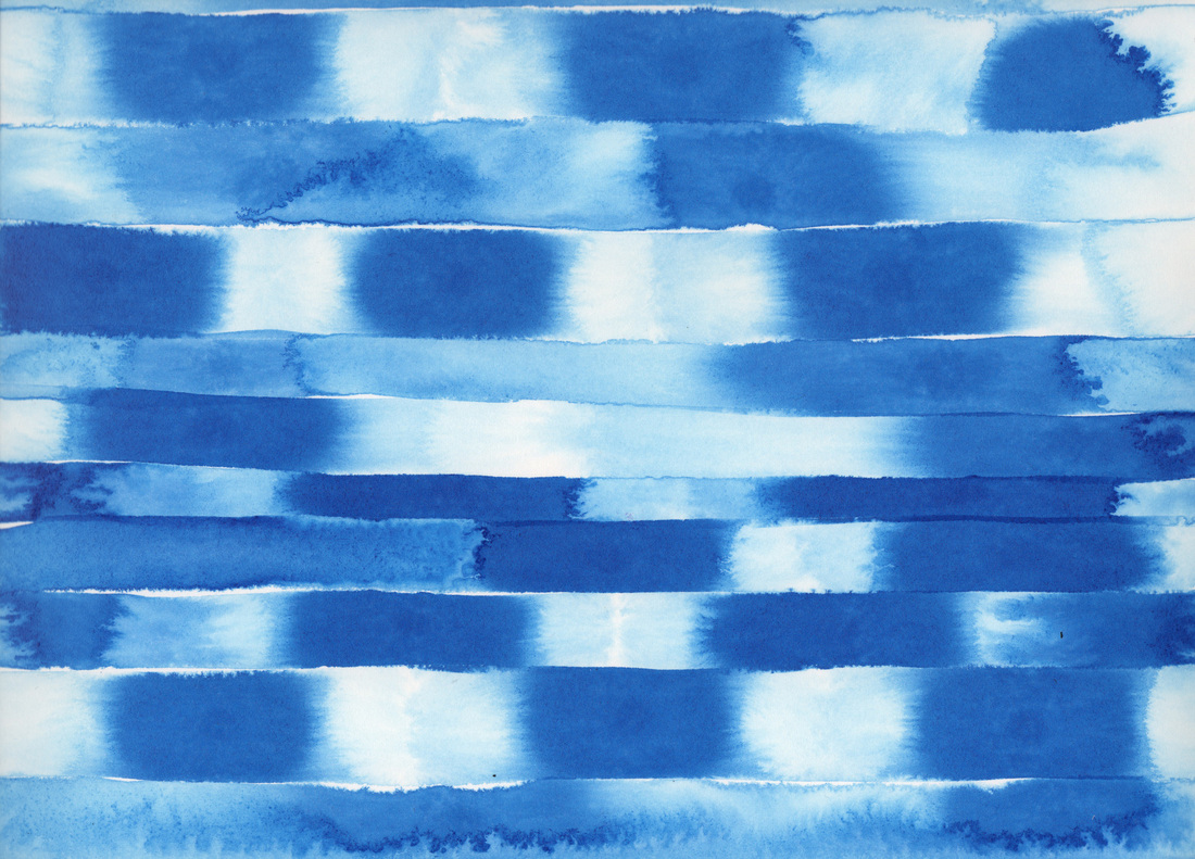
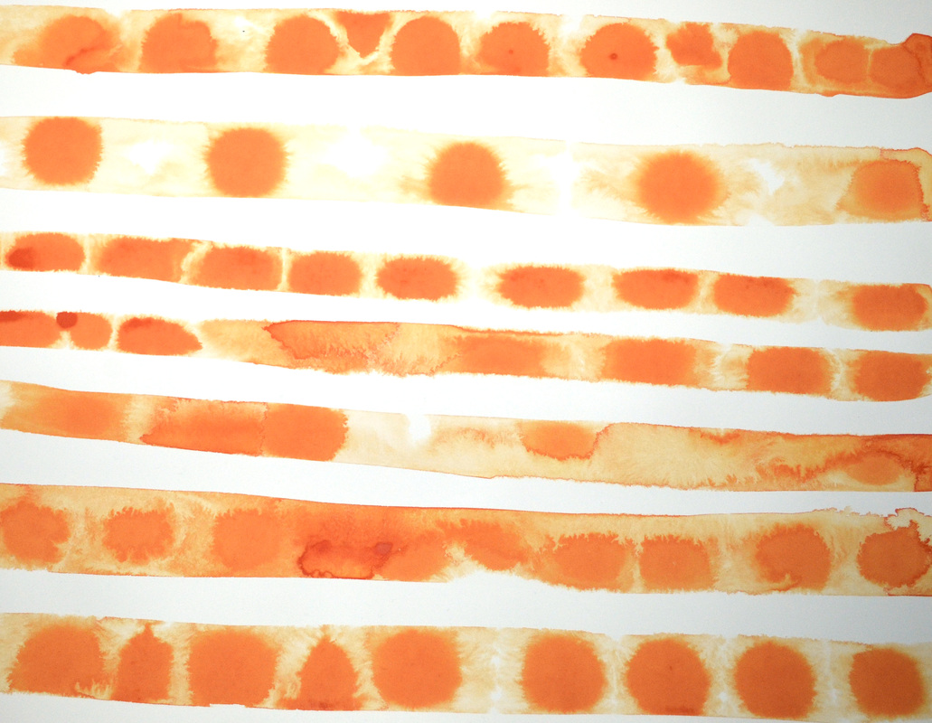
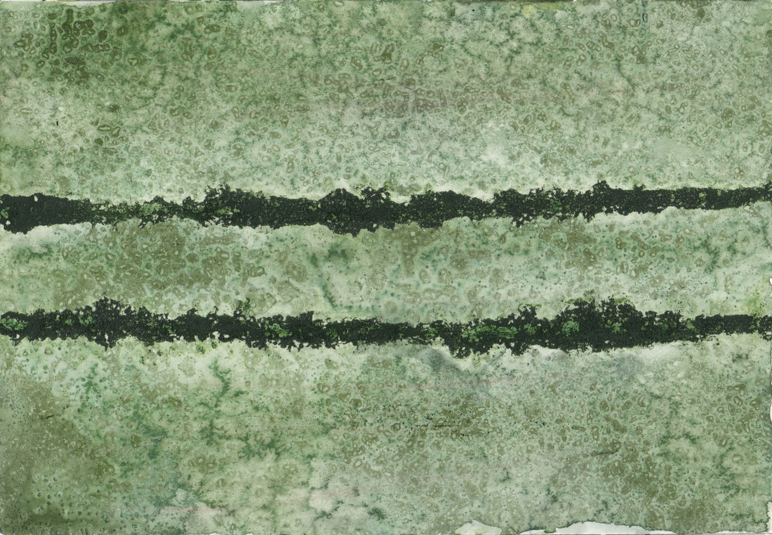
Ludwig Mies van der Rohe stated, "Architecture starts when you carefully put two bricks together. There it begins." I would argue the same is true when you put two paint strokes together. Happy Wednesday Y'all!
0 Comments
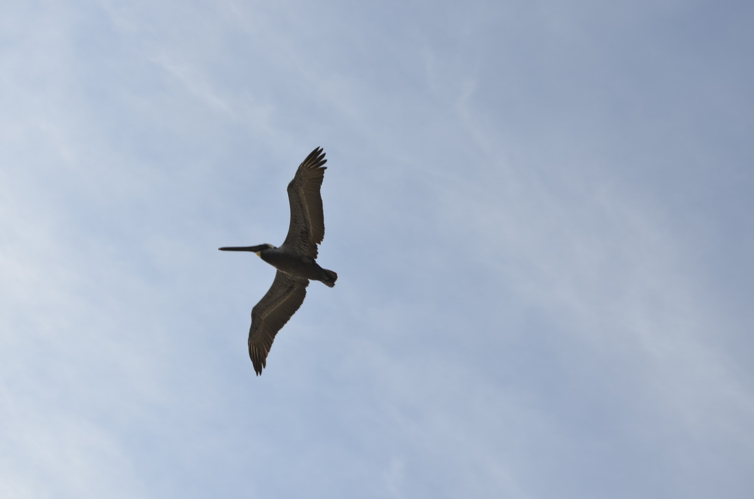
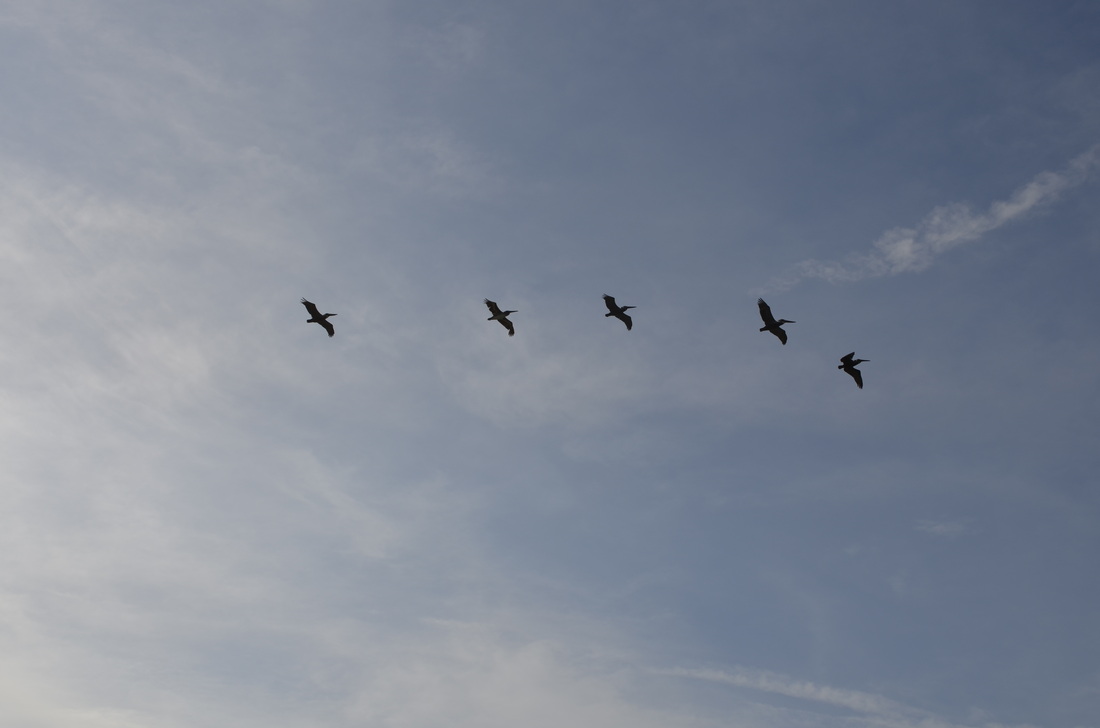
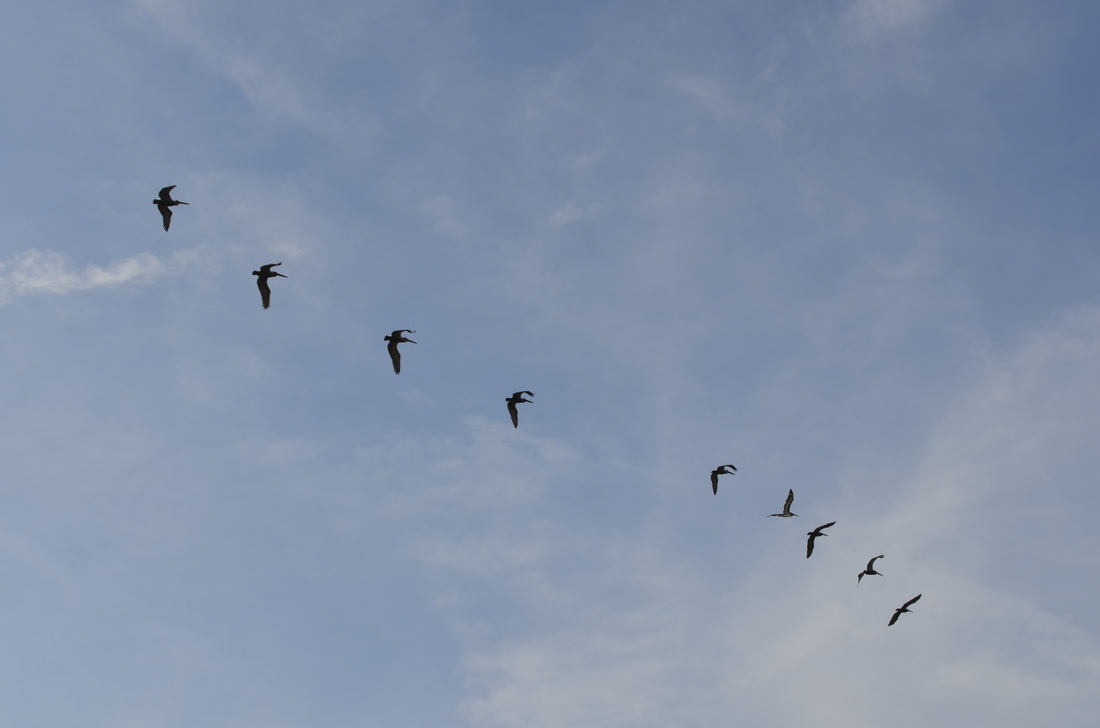
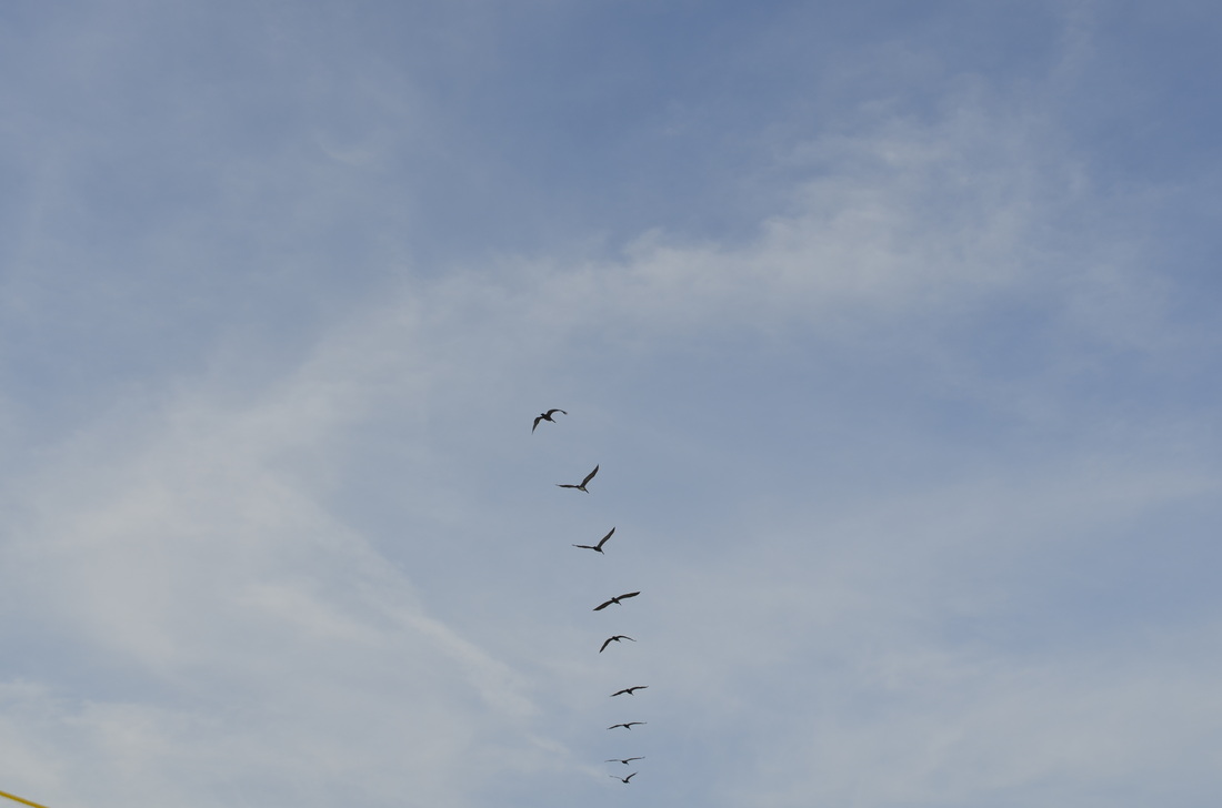
Birds in flight are remarkable. They soar & undulate. Riding on currents we can't see. Falling to the ground & at the last minute catching that invisible draft & remaining aloft. I was camping this past weekend & enjoyed watching lines of pelican soar overhead. Happy Tuesday Y'all!
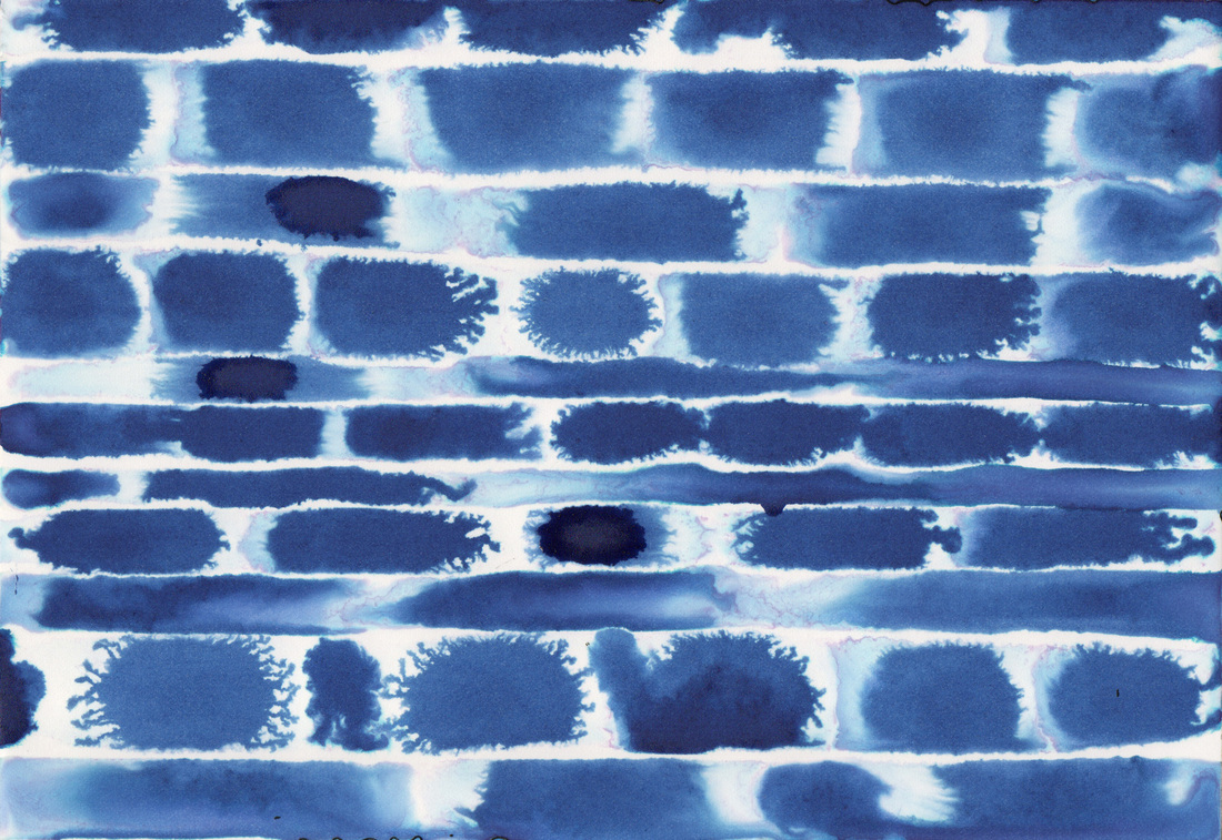
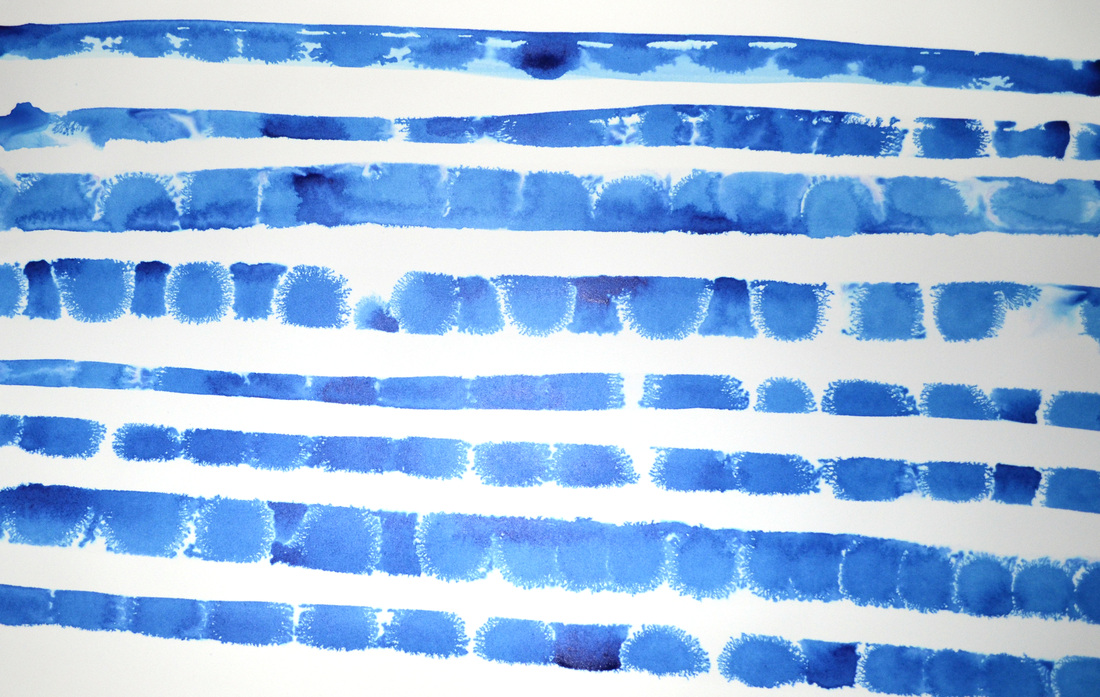
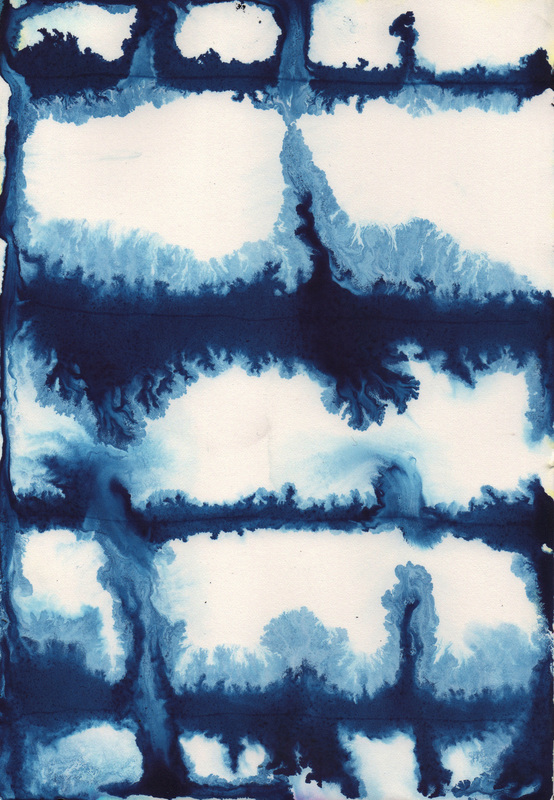
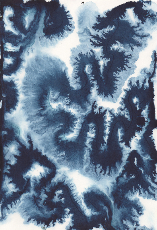
It is interesting to me how expansive the Bombay Blue is. It just sprints across the wet paper, whereas the Higgins is much more contained & at times hydrophobic. These painting remind me of clouds or brick walls & I am pleased with that dichotomy. Happy Monday Y'all!
Not going to say much about these except they are big & bright, & still very much in their formative days. Happy Thursday Y'all!
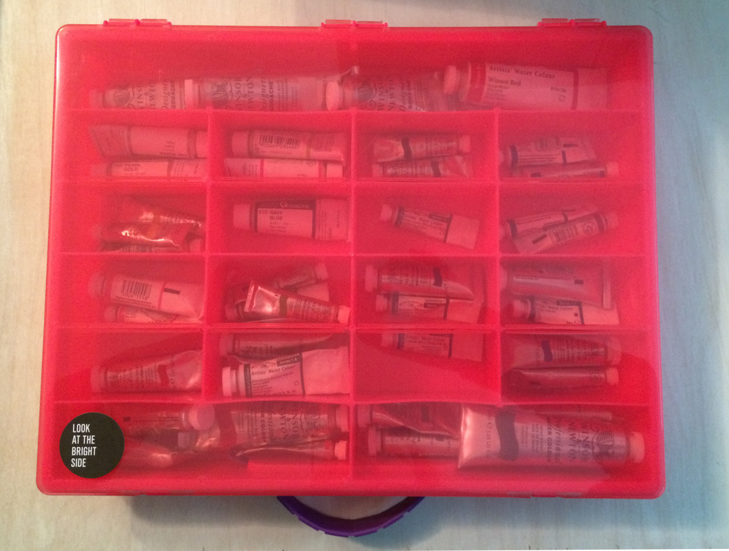
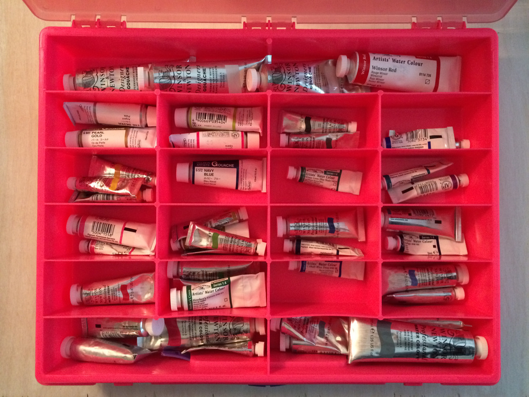
If you have any school age child in your life then you probably are aware of Rainbow Loom & their status as this years must have plastic bracelet/ craft item. Fortunately for me they are everywhere along with their accoutrement as recently I was in a conundrum over how to store my paint tubes. Keeping them in a large glass jar looked cool, but was not practical. It seemed I was always needing the paint on the bottom of the jar & was perpetually dumping the jar out to find what I needed. It also made it difficult to keep track of how many tubes I have in a certain color. Hence my joy over Rainbow Looms ubiquitousness. Their storage system for loom & rubber bands is perfectly sized for watercolor paint tubes. Yes, some compartments have more than one color in them, but overall my collection fits nicely. Organization of materials cannot be underestimated. I found this box at Michaels. So if you are in the, "What do I do with my paints?" conundrum, may I humbly suggest a Rainbow Loom box. Happy Wednesday Y'all!
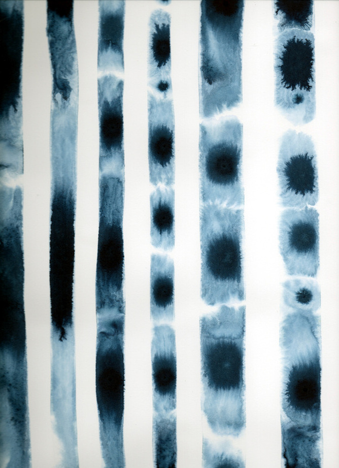
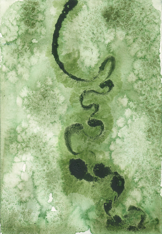
How does the Dr. Ph. Martin's Hydrus behave when it is the only thing on the page? The test on the left is with cobalt in four lines on a wet pieces of Arches. The test on the right was executed with Payne's Grey in a squiggle fashion.
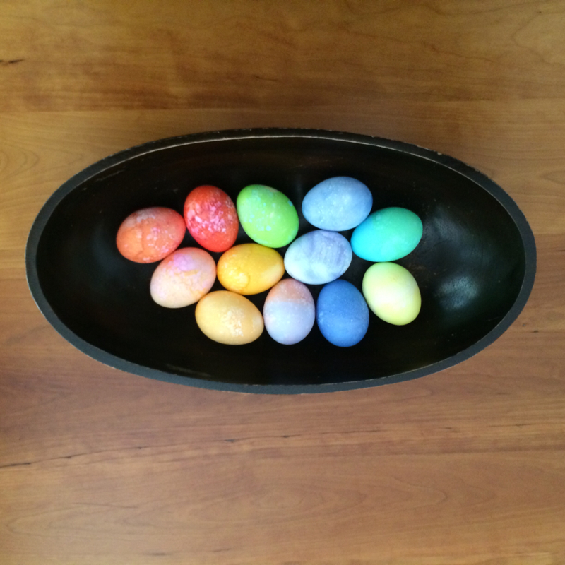
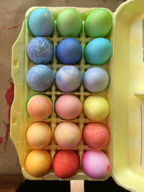
Some of you might wonder why I approach things with the idea of testing & scientific inquiry. First, my education is in printmaking. While I have not pulled a print in awhile the method of testing your acid & mixing your ink, along with the traditional practice of different states for a plate are still very much a part of my modus operandi. Second I had a great science teacher in high school, for three years in a row. She expected nothing less than perfection & while I often fell short, her strive for excellence meant that I still learned a lot. One of the things that seems most applicable to the work I do not is the Scientific Method: Problem, Hypothesis, Thesis, Testing, Revision, Testing, Testing. Sounds like making a painting, a print, understanding materials. Thanks Dr. Drew! Did you know how much your methods would help an artist? Happy Monday Y'all! I love dying Easter Eggs. I have since I was little. It has always been magic to me how you put that white egg in and the color adheres et voila you have a colored object. I am thankful for the empty tomb & the eggs symbolization of that. Happy Friday & Happy Easter Y'all!
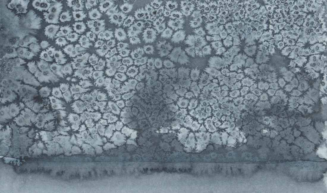
I am always so intrigued by the colors that come out when salt is used as this painting was done entirely with Payne's Grey. But right at that point where it transitions from the solid bleed to the salted area there is what appears to be another color. I wonder if it is impurities in the salt or water that cause this? It really seems limited to that area & I can assure you that my brush did not dip into another color for that section so what is going on? I don't know. Any insights would be appreciated. Happy Thursday Y'all!
|

