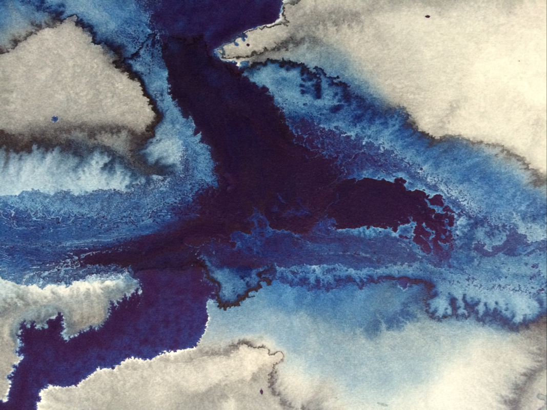
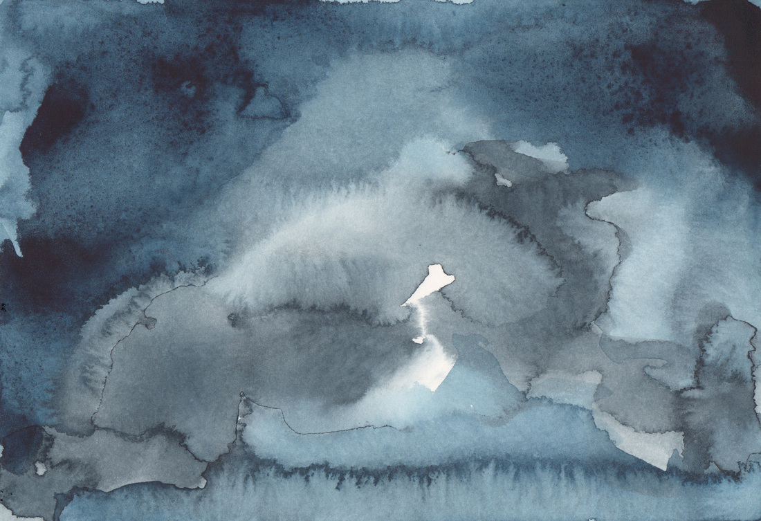
I made this painting with the intention of using it as the background for a text-based piece. But when I saw it I knew it was finished just the way it is, so no text. That is the thing about working with salt, it is unpredictable. I thought that I had thoroughly & evenly distributed the paint across the surface, but as the deep blue lake in the middle clearly establishes I had not. The salt reveals deeper nuance in the materials. Happy Wednesday Y'all!
0 Comments
Still working on the correct ratio if I am only using the Winsor & Newton paint. There is no cracking, but it also lacks the dynamism & vibrancy of the two companies' paint in tandem. So I am faced with the dilemma of non-archival art, that can theoretically survive for a long time (just not tangible forever), but certainly as pixels as long as we have computers. Or make work that can will not degrade over time, but might not be as good... Well when I write it out like that, there is a clear winner. Thanks blog for helping me figure things out. Always make the better work! Happy Tuesday Y'all!
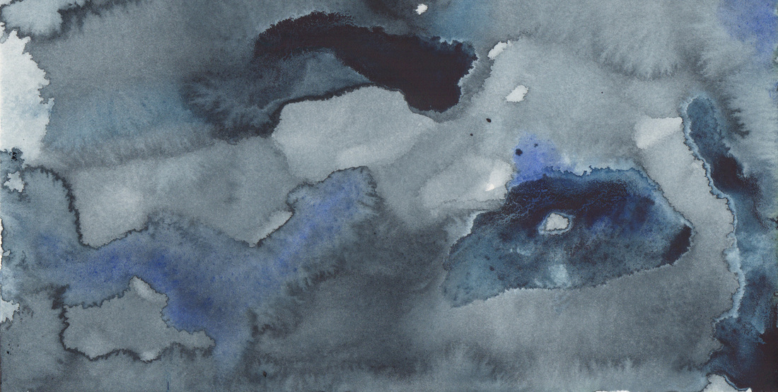
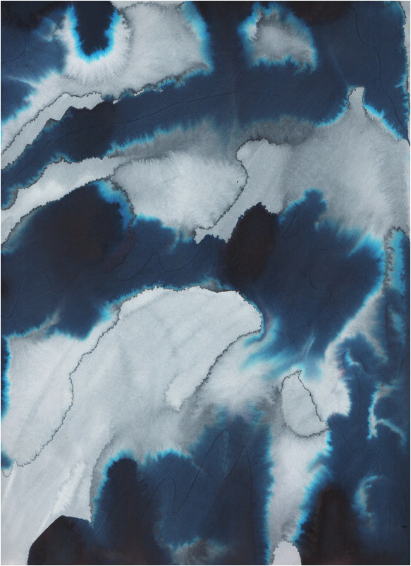
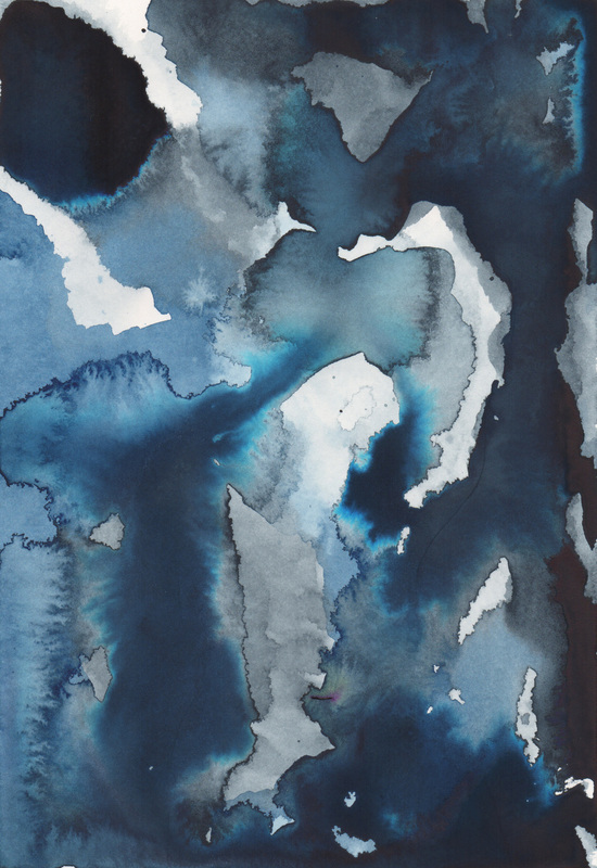
Since the Revolutionary War continues on in the actions of Dr. Ph. Martin Hydrus and Winsor & Newton Artists Colour, I decided I would see what I could do with paint from the other side of the pond, since their product has long been my staple. The painting depicted above is done with Payne's Grey, Indigo, Prussian Blue, Cobalt Blue (Deep), & French Ultramarine. There is still some craculature... so I wonder if this is just the result of too much pigment in one area? Perhaps a switch in paper is the next step? Things to think about. Happy Monday Y'all!
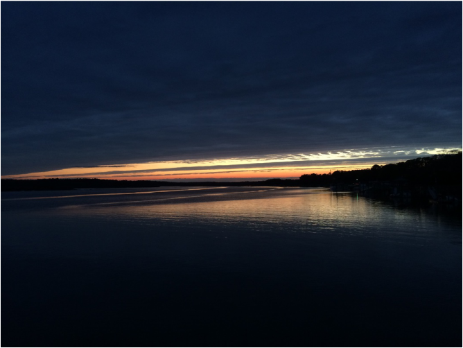
I keep the subject of my inquiry constantly before me, and wait till the first dawning opens gradually, by little and little, into a full and clear light. -Isaac Newton (1642 - 1727)
While this is a photo of the sunset on the May River, I think it aptly illustrates Newton's quote, as the recession of the light is so clear in this image. Happy Friday Y'all! 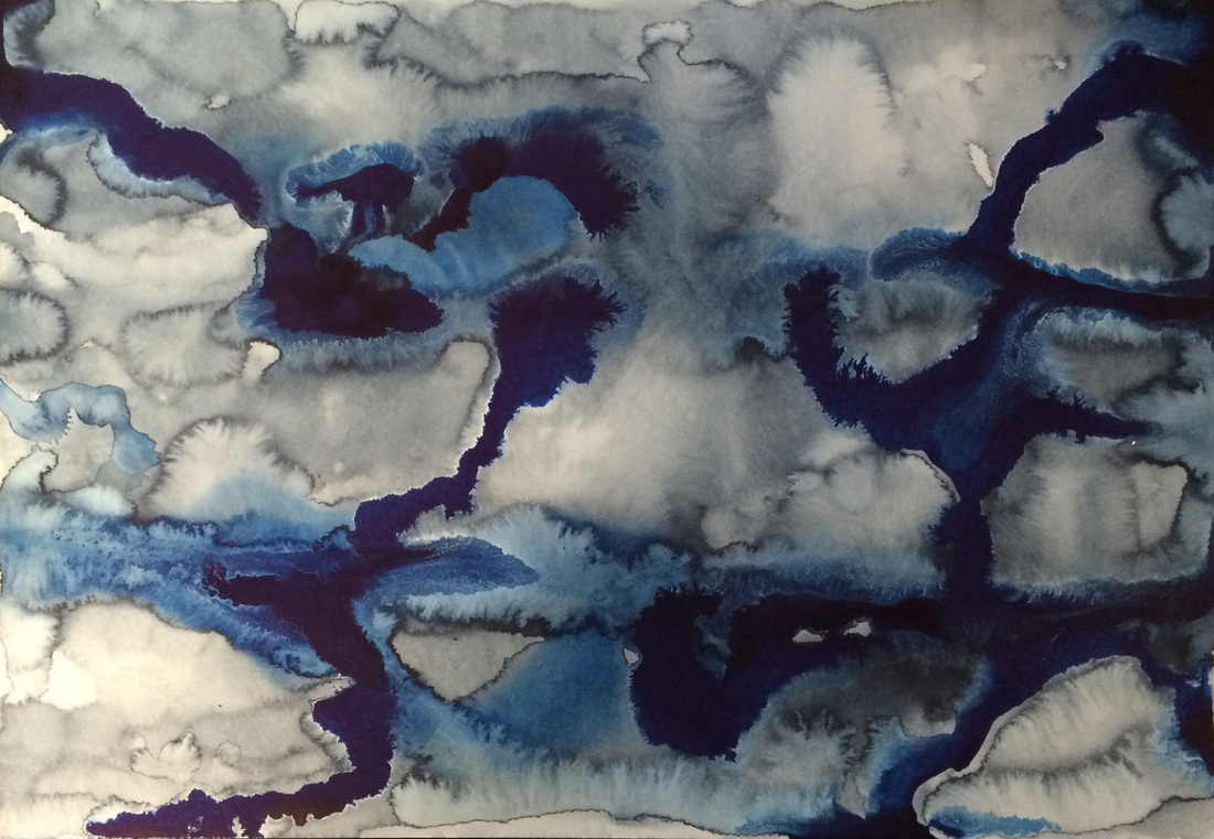
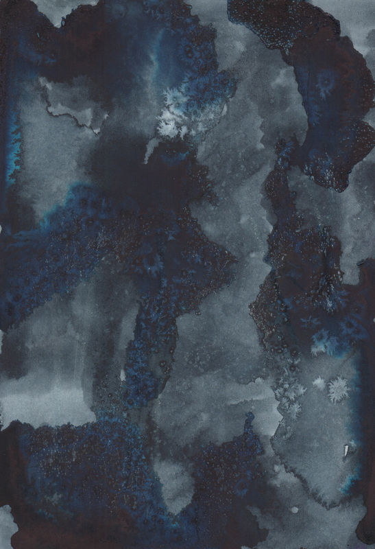
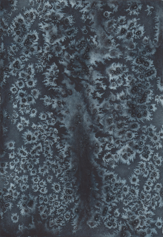
Yesterday was spent experimenting with the Hydrus Watercolors. As you can see from the image above they seem to crack, rather than bleed. I am uncertain as to the cause of this, but will, of course, be conducting more experiments. Happy Wednesday Y'all!
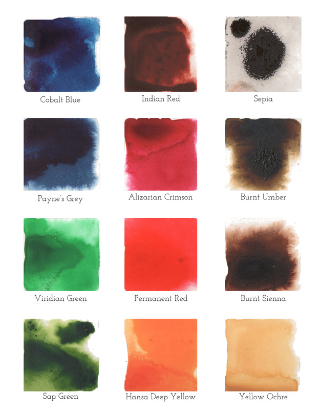 One of the first things I have done in almost every painting class I have taken is paint a color chart or a color wheel. I never gave much thought to that in my current practice, but then yesterday I was painting this chart after acquiring the Dr. Ph. Martin's Set #2, & it occurred to me that painting a color chart is a great introduction to your materials, while simultaneously removing the pressure to produce "art." The first block I painted was the sepia, as a lefty I work from the upper right across the page. It was so granular that I am emailing the company today to find out if this is usual. Rest assured I had thoroughly shaken the bottles before testing, as who knows how long they were on the shelf. The burnt umber & sap green also had some granulation, but nothing compared to the sepia. If I had not done the color chart I would not have known this paints attributes & might have mistakenly placed a dropper of them on a painting expecting them to morph in the manner of the others. I would have wrecked a painting. So what am I saying with all of this? Check your materials whatever they may be, know their properties & attributes & learn how to best work with them. I am sure there is a life lesson in there. Happy Tuesday Y'all!
P.S. Contacted Dr. Ph. Martin regarding the sepia. Response within 5 minutes, new bottle on the way. Customer Service for the Win!
 To see the earth as it truly is, small & blue & beautiful in that eternal silence where it floats, is to see ourselves as riders on the earth together, brothers on that bright loveliness in the eternal cold.
-Archibald MacLeish (1892 - 1982) While I think Mr. MacLeish takes a very lonely cold view of our earth, I do love his language & its pairing with this painting. Happy Friday Y'all!
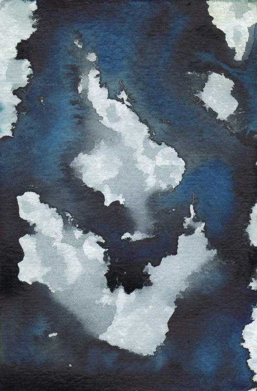
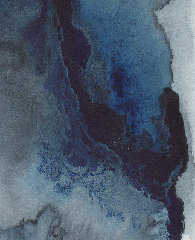
"I should have know it was yours, because of the blue." Someone that knows my work well once said this after seeing one of my pieces in a group show. Until that moment I had never considered my use of blue. It is interesting how we do things & are completely unaware of the choice we make. Since that comment however I am acutely aware of how much blue I use. In fact the comment started a cascade in my thoughts & almost every series I have completed, if it has not been black & white, has been blue. So it is not surprising to me that I am enjoying these blue experiments with the Dr. Ph. Martin & Winsor & Newton paints best. Happy Thursday Y'all!
|