
|
Today I will share my palette & answer the questions that I pose to others, Seems only fair, right? 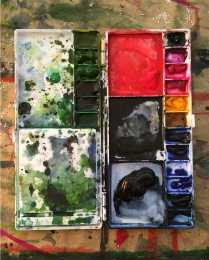 I think my next palette will forego sepia (in the upper right). It was included on the off chance I felt compelled to do a traditional landscape, but the likelyhood of that happening is .006%. So the next palette will leave out sepia. My favorite brush is a Princeton Brush Company 16 Round Neptune. The amount of paint it can deliver to the page is impressive & satisfying. For painting I will always choose a hot press, preferably Aquarelle Arches Watercolor Blocks. They are not manufactured in large enough sizes for my current vision so I use other papers. But in my heart of hearts my favorite paper is Rives BFK, 280gsm. This is the printmaking paper I use & my most long-lasting relationship with any product. The surface is super absorbent, but still bleeds allowing for color saturation & intensity. I gravitate towards colors that are almost black, but with cool-toned nuance. Without a doubt my favorite color is Payne's Grey by Winsor & Newton. Is it grey? Is it blue? Surely not black? This versatility is what keeps me using this color over & over. I also happen to think it is pretty. A close second in terms of favorite color would be Perylene Green, also by Winsor & Newton, also almost black. Those are my answers & like everything else they are subject to change, but I hope you find them useful & perhaps they will lead you down a different painting road you had not yet thought to explore. 
0 Comments
Your comment will be posted after it is approved.
Leave a Reply. |