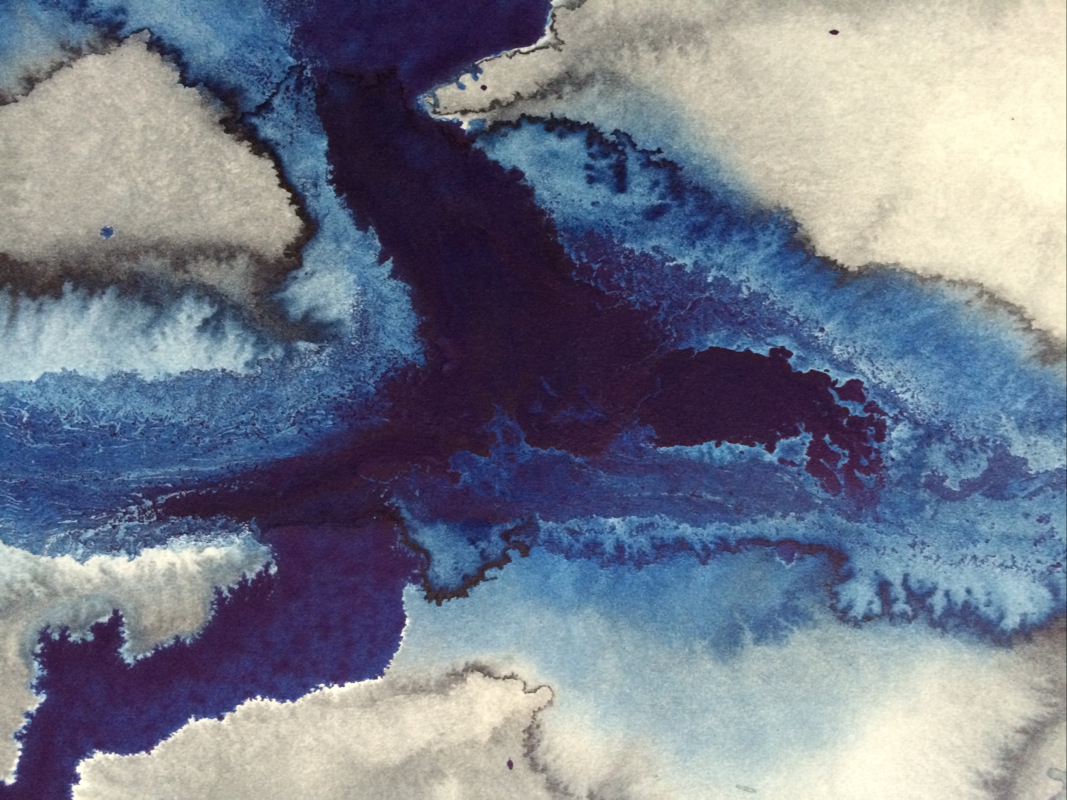
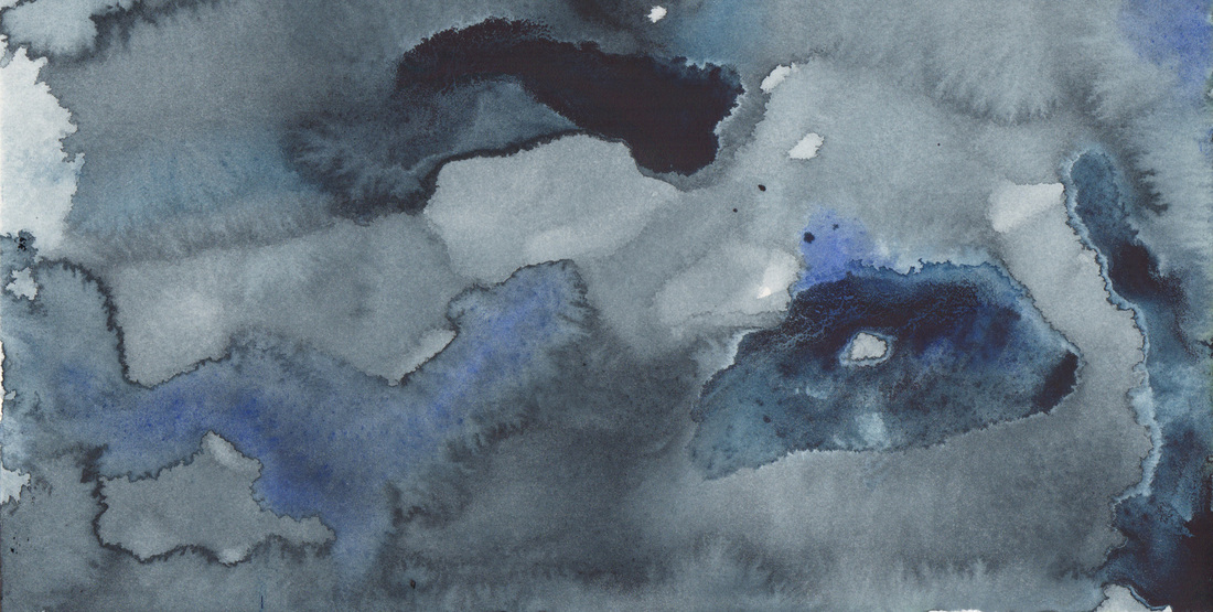
I am always so intrigued by the colors that come out when salt is used as this painting was done entirely with Payne's Grey. But right at that point where it transitions from the solid bleed to the salted area there is what appears to be another color. I wonder if it is impurities in the salt or water that cause this? It really seems limited to that area & I can assure you that my brush did not dip into another color for that section so what is going on? I don't know. Any insights would be appreciated. Happy Thursday Y'all!
0 Comments
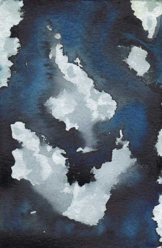
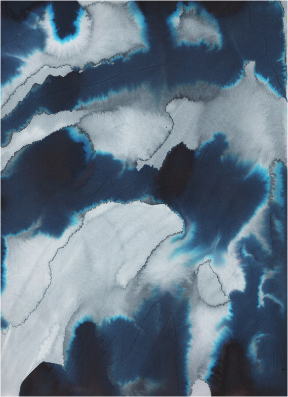
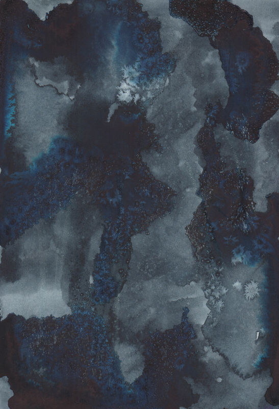
Since the Revolutionary War continues on in the actions of Dr. Ph. Martin Hydrus and Winsor & Newton Artists Colour, I decided I would see what I could do with paint from the other side of the pond, since their product has long been my staple. The painting depicted above is done with Payne's Grey, Indigo, Prussian Blue, Cobalt Blue (Deep), & French Ultramarine. There is still some craculature... so I wonder if this is just the result of too much pigment in one area? Perhaps a switch in paper is the next step? Things to think about. Happy Monday Y'all!
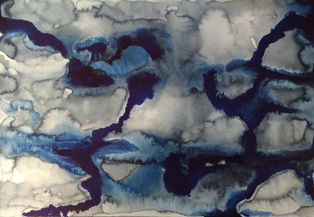
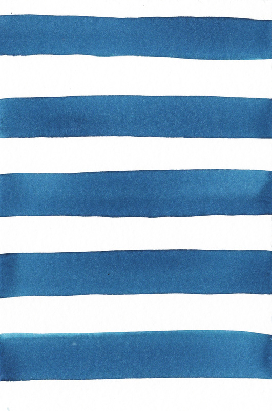
"I should have know it was yours, because of the blue." Someone that knows my work well once said this after seeing one of my pieces in a group show. Until that moment I had never considered my use of blue. It is interesting how we do things & are completely unaware of the choice we make. Since that comment however I am acutely aware of how much blue I use. In fact the comment started a cascade in my thoughts & almost every series I have completed, if it has not been black & white, has been blue. So it is not surprising to me that I am enjoying these blue experiments with the Dr. Ph. Martin & Winsor & Newton paints best. Happy Thursday Y'all!
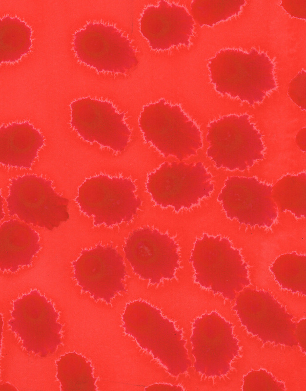
Well the experiments continue. The deeper darker red is the Dr. Ph. Martin's Wild Rose & the more orange, in this comparison, red is Winsor Red by Winsor & Newton. The Dr. Ph. Martin's definitely don't respond to salt in the same expansive manner, much more of a subtle texturing instead of a bold patterning. I am also intrigued by the white lines, that are particularly obvious in the spot painting, that surround the interaction of the two paints. It is almost as if they repel each other... Things to notice & push the boundary of. Happy Wednesday Y'all!
Finally an image I am satisfied with. After a week of experimenting with the Dr. Ph. Martin paint I finally had a breakthrough, thanks to something my friend Lydia Makepeace said about how she uses the paint: just use the dropper to apply the pigment directly to wet paper. Ah, the clouds parted & the heavens opened! Such a better working method for this paint. Huge thanks to Lydia for the insight! I persevered with this paint, because the colors are so vibrant & different, than my favorite Winsor & Newton's. I am excited to see where things go now. Happy Tuesday Y'all!
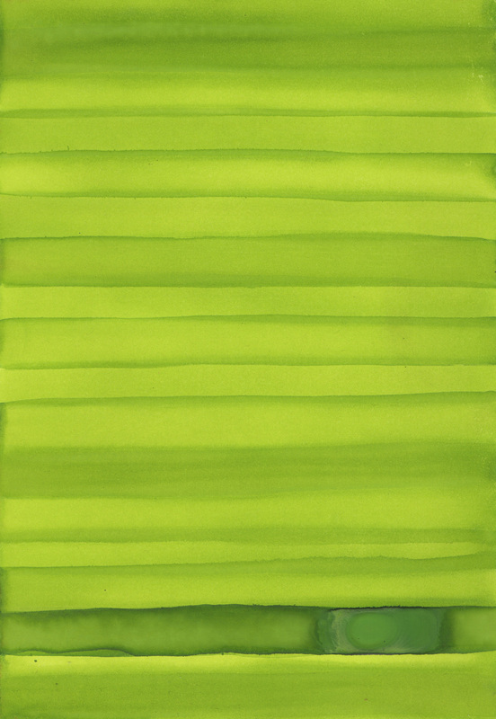
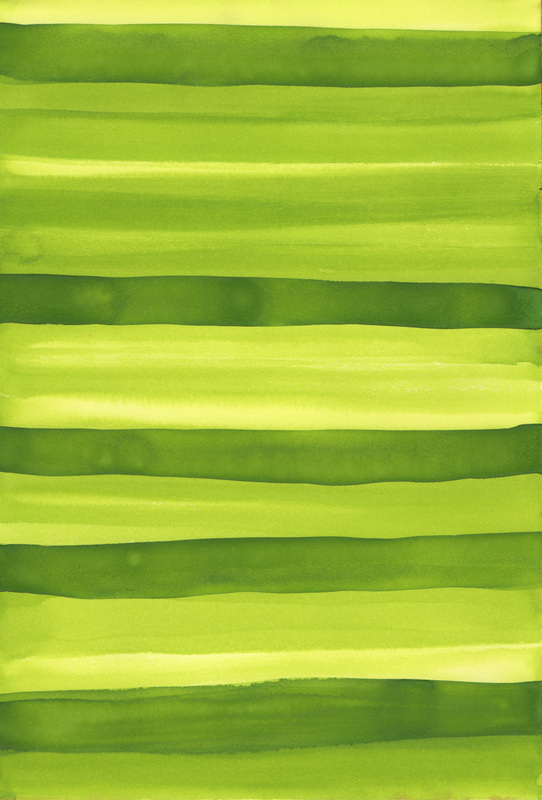
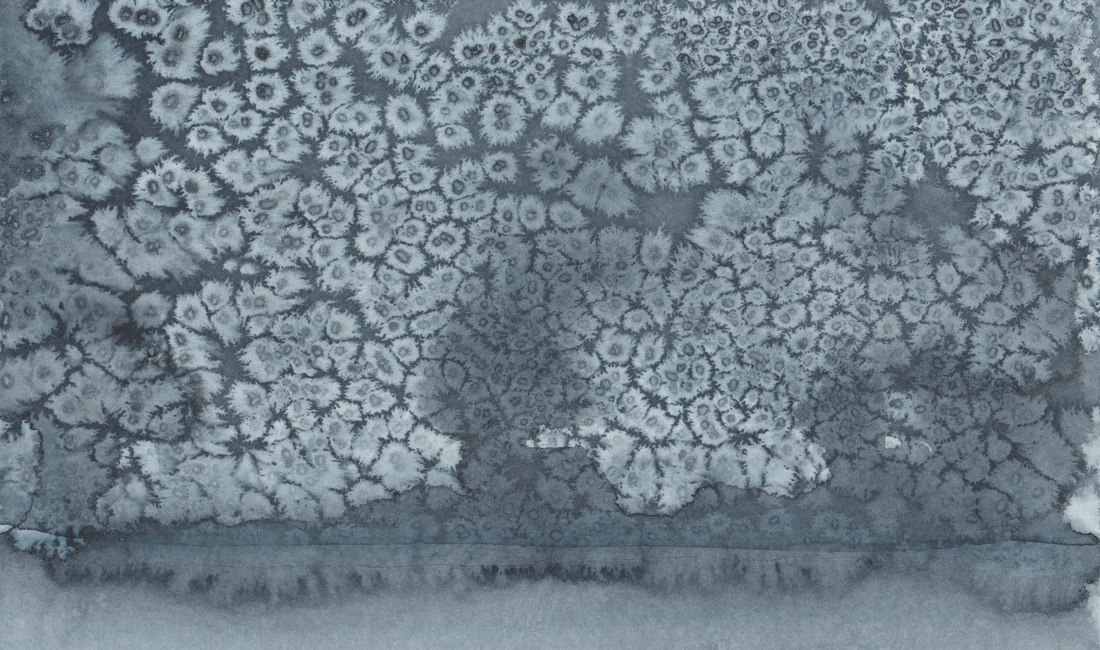
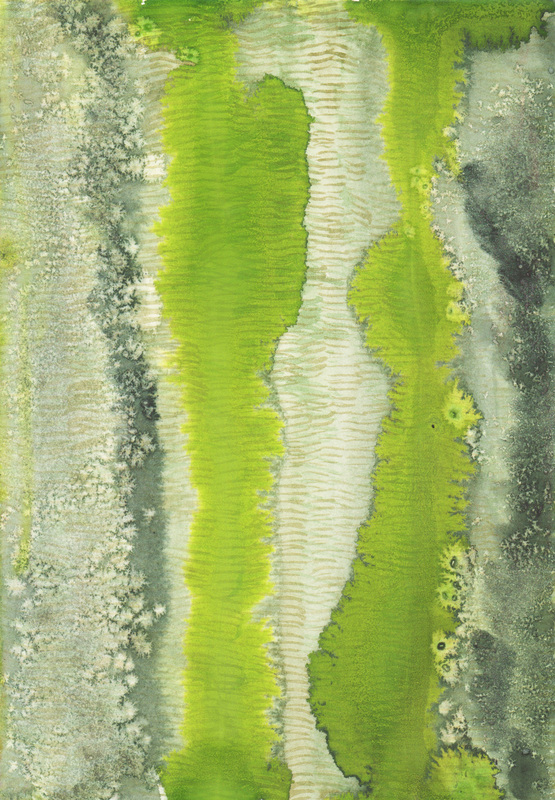
We had rain last week & most of the grass really greened up into that vibrant chartreuse color that happens for a moment in the spring. There is one spot in particular that I drive past that seems particularly lush with visible mowing lines. Additionally, I often drive past it in the afternoon when the light is shining thru the trees causing dark lines of cast shadows. That vision of grass is definitely the inspiration for the paintings. And while I have not fallen in love with the Dr. Ph. Martin watercolors I am thankful I persevered long enough to make these paintings, as I think think their chartreuse color is spot on. Happy Monday Y'all!
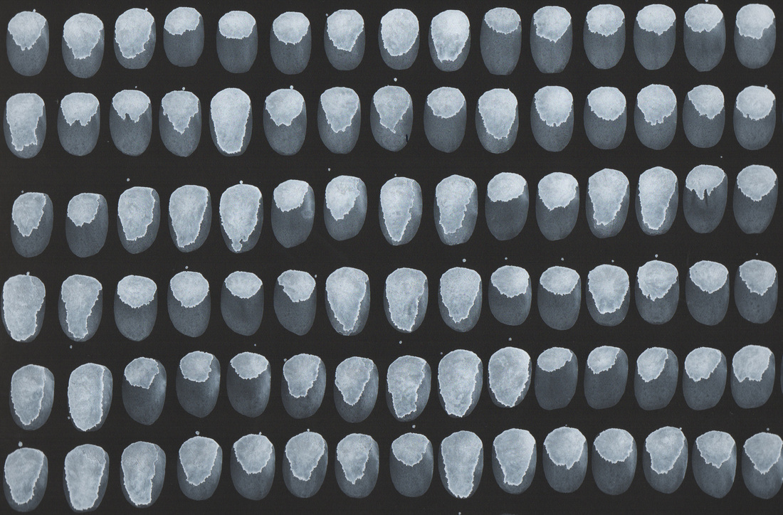
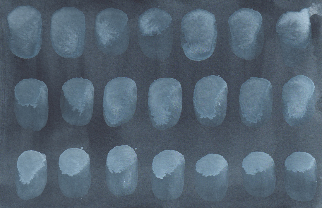
I know that one the internet it is sometimes difficult to comprehend the scale of things so let me assure you this is A LOT more oyster shells of one sheet of paper then have previously appeared. That is because along with acquiring the Dr. Ph. Martins watercolor I purchased another Princeton Neptune Oval Wash brush, but this one is only a 1/2in, as opposed to a 3/4in. You might think 1/4in. difference, no big deal, but it is! That 1/4in. takes away a third of the brush area, a full third. Hence the brush does not retain as much pigment & the individual strokes turn out quite differently. Of course, I love the brush & its hand feel, but again some of the nuance disappears when I do not have as much pigment to work with in the brush. This seems to be my unintended theme of the week: not as much nuance. Oh well... next week is another opportunity to try again. Happy Friday Y'all!
|