|
Today's palette comes from Dallas Clayton! I feel like an exclamation point is necessary here because Dallas is so ebullient as you will see in his answers below. I don't remember how I found his work, but I do know that following him on Instagram is one of the best things a person can do, as it brings truth & joy to your day. You can also check out his merch & his very awesome world where you can watch a 1 minute video that shows you just how remarkable Dallas Clayton is. And if you need a last minute Christmas gift, I highly recommend An Awesome Book of Love. Peace 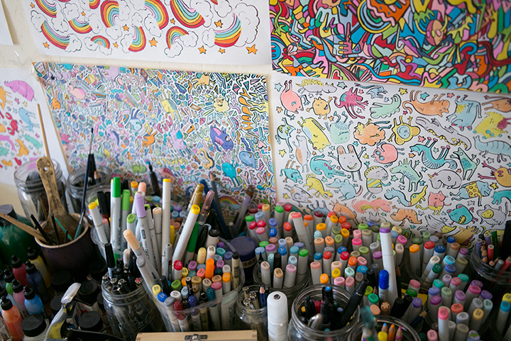
What color do you wish wasn't there? All colors are pretty important. Let's not go choosing sides. What is your favorite brush? I just use whatever is called for at the time. What is your favorite paper/surface to paint on? Anywhere you aren't supposed to. What is your favorite color to work with? I like the color of the sky just before night turns into morning. 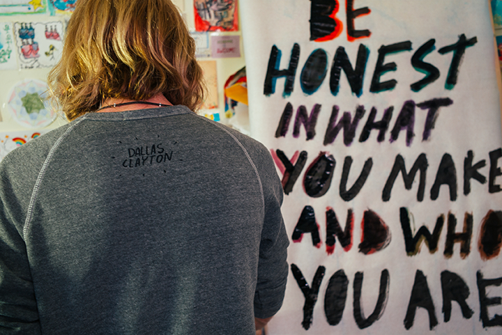
0 Comments
I came across Jess Bruggink's work on instagram & loved her colorful readable combinations of watercolor & text, what she calls "watercolorwords". At the moment she is running a generous promotion on her etsy site, where 100% of the proceeds go to charity:water; I know you will find that last Christmas gift you are looking for in her shop. Jess' fun playful work is definitely worth an in-depth look, as it is sure to brighten your day. So check out her website, instagram, dribble, twitter for all of the goodness on display. And be sure to read her #paletteproject answers below. 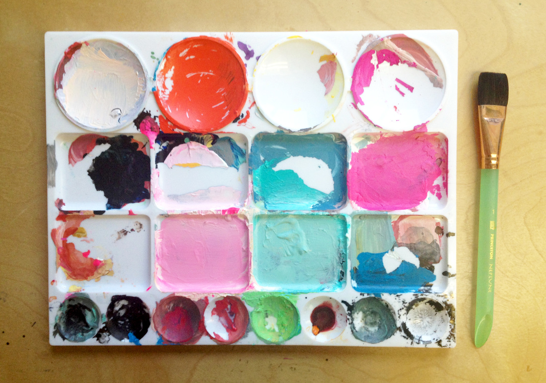
What color do you wish wasn't there? Maybe the dark brick red color although it balances the brights and pastels nicely. What is your favorite brush? I am still learning what brushes I like to work with so I've been trying lots of different kinds out. I really love this 1 princeton neptune brush in the photo for acrylics and watercolor. It also happens to be super pretty. Most often I use different cheap round brushes but I am slowly building up my supply of nicer ones. What is your favorite paper/surface to paint on? I've been painting on arches 140 lb cold press watercolor block. I've also recently started using more hot press paper. I like switching back between smoother papers and ones with more texture. I really like painting on smooth acrylic hard board too. Just depends on what type of painting I'm doing and on my mood! What is your favorite color to work with? I tend to gravitate toward bright orange reds and hot magentas mixed with subdued neutrals. I'm also loving neon opera pink gouache. 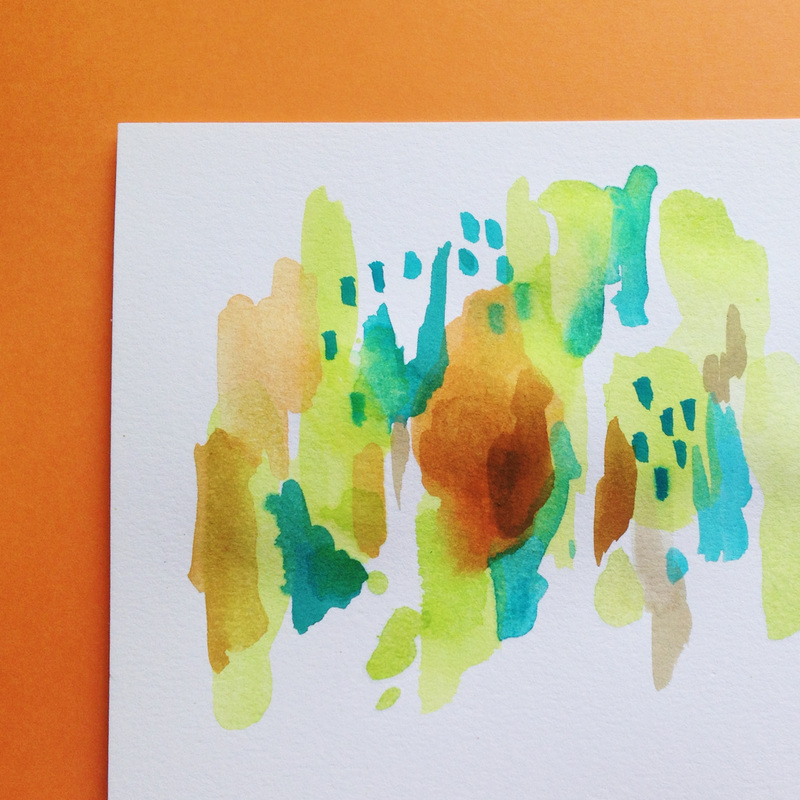
Today I will share my palette & answer the questions that I pose to others, Seems only fair, right? 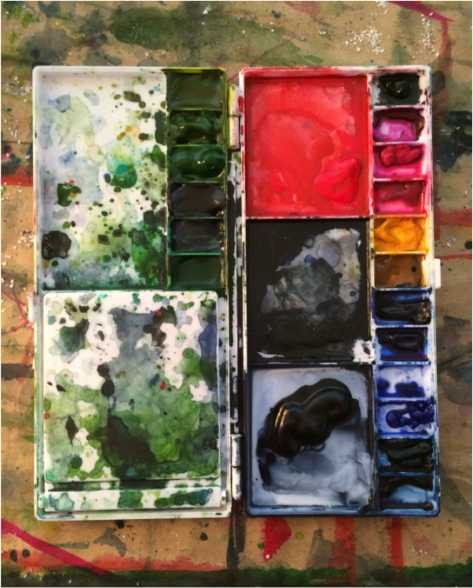 I think my next palette will forego sepia (in the upper right). It was included on the off chance I felt compelled to do a traditional landscape, but the likelyhood of that happening is .006%. So the next palette will leave out sepia. My favorite brush is a Princeton Brush Company 16 Round Neptune. The amount of paint it can deliver to the page is impressive & satisfying. For painting I will always choose a hot press, preferably Aquarelle Arches Watercolor Blocks. They are not manufactured in large enough sizes for my current vision so I use other papers. But in my heart of hearts my favorite paper is Rives BFK, 280gsm. This is the printmaking paper I use & my most long-lasting relationship with any product. The surface is super absorbent, but still bleeds allowing for color saturation & intensity. I gravitate towards colors that are almost black, but with cool-toned nuance. Without a doubt my favorite color is Payne's Grey by Winsor & Newton. Is it grey? Is it blue? Surely not black? This versatility is what keeps me using this color over & over. I also happen to think it is pretty. A close second in terms of favorite color would be Perylene Green, also by Winsor & Newton, also almost black. Those are my answers & like everything else they are subject to change, but I hope you find them useful & perhaps they will lead you down a different painting road you had not yet thought to explore.  Lydia & I have know each other for almost 10 years. We were paired as roommates, in the now shuttered NYCAMS program. What impressed me then & what impresses me now is Lydia's determination & commitment to research. She is always looking at new sources & incorporating them into her vast knowledge base. Her answers below are generous & I have elected to not place them in the Q&A format as the questions are self evident in the answers. If you enjoy Lydia's work please check out & follow her on all of the social media: facebook, instagram, etsy (her paintings make great gifts), pinterest & her newly redesigned website. Thank you Lydia for sharing your work with us! 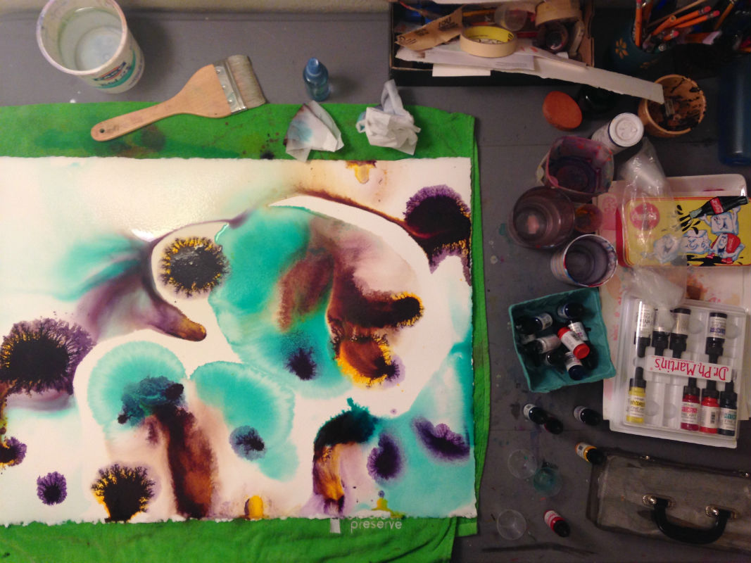 You’ll notice that the first picture is of my work surface. I do not use a palette for my current series of abstract watercolors inspired by aquatic life. I use Dr. Ph. Martin’s Hydrus Fine Art Watercolors, which come in bottles with droppers, and I don’t premix colors before applying to the paper. Paint is either applied right from the dropper or diluted in varying amounts of water in medicine cups before being poured onto wet paper. No brushes are used to apply paint, only to pre-wet the paper. I find a Hake brush to be ideal for applying large amounts of water and evenly coating full sheets of 22” x 30” watercolor paper. Arches 300lb watercolor paper is my paper of choice. Arches is readily available and the heavier weight paper is especially suited for large paintings and heavy washes. My favorite color is Ph. Martin’s Quinacridone Magenta because of its vibrant warmth, energy and the varied colors it creates as part of my glazing process. I’m forever running out. My least favorite colors are probably the brown shades because I am so drawn to vibrant colors. My love of color is limitless!  Happy Thanksgiving to all the Americans reading this & I'll see you on Friday!
 I don't remember the first time I saw Jennifer Orkin Lewis of August Wren's work, but I do know I promptly followed her Instagram & Facebook so I could see more of her wonderful illustrations. The colorful conversational pieces she creates always bring a smile with their loose lines & vibrant colors. Jennifer has a great collection of archival prints, from her painting a day series, available on Etsy that I would strongly recommend checking out as well. She has graciously answered the palette project questions below. JCH: What color do you wish wasn't there? JOL: Maybe the sienna brown up towards the top, But I do use it so it needs to be there. JCH: What is your favorite brush? JOL: Nothing special, I've been using the Winsor & Newton Cotman brand and they are fine for the moment... JCH: What is your favorite paper/ surface to paint on? JOL: I love a beautiful hot press watercolor paper with a fine tooth. But lately I've been using an inexpensive sketchbook from MUJI and I love the way the paint lays on that, and I'll use cheap computer paper and kraft paper sometimes! JCH: What is your favorite color to work with? JOL: I skew green... sage, olive, dusty teal. And I'm loving Perylene Violet these days. 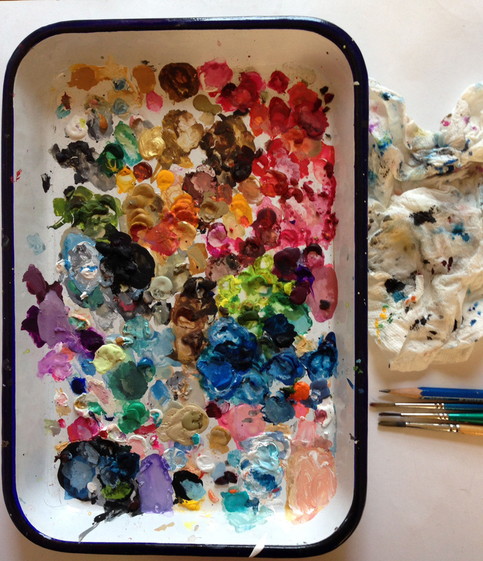 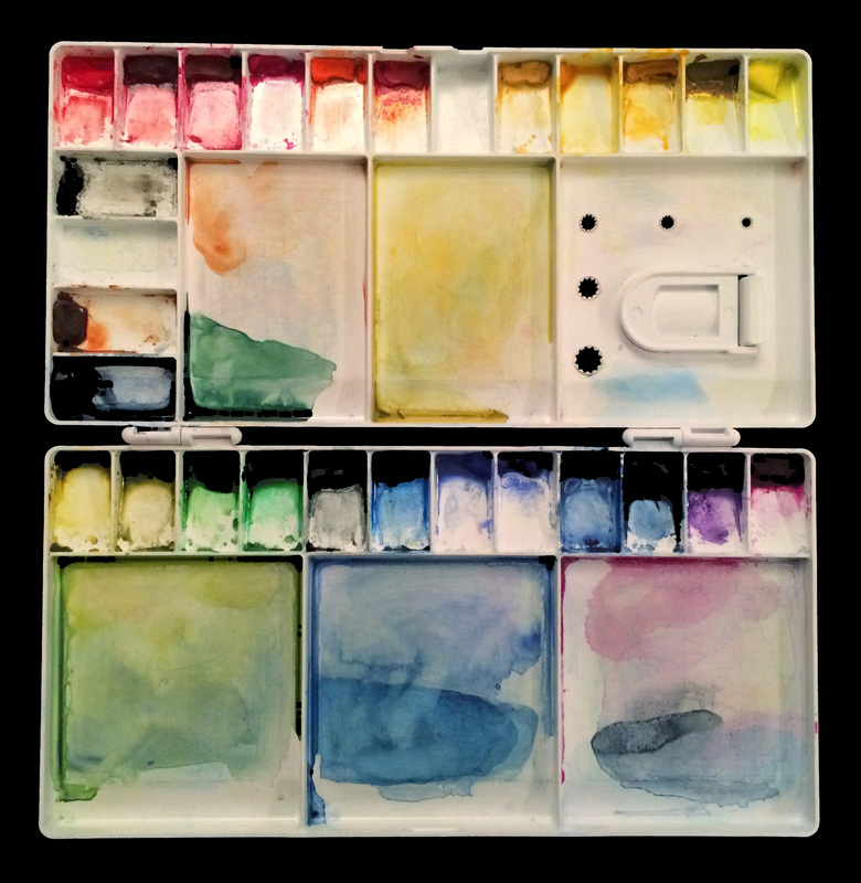
Today's palette comes from Theresa Hendrickson, my mother. She is a watercolor artist, that frequently paints landscapes & objects found on walks. Her eye for capturing the natural world is amazing. I tagged along to her first watercolor landscape painting class. While I struggled even getting paints on the paper, she laid in the grasses, barn, water & sky as if she had done it 10,000 times before. Her skill is unquestionable. Follow Theresa on Instagram for more gorgeous watercolors. J: What color do you wish wasn't there? T: This is a relatively new palette. The colors are pale as compared to all of my previous palettes. I think I would get rid of the "opera pink" in this line up. J: What is your favorite brush? T: My favorite brush is a 1 inch flat that I have had for at least 10 years. J: What is your favorite paper/surface to paint on? T: I use "Winsor and Newton" watercolor, and "Arches" 140 lb. Hot Pressed Paper. J: What is your favorite color to work with? T: One new color that I am especially enjoying is "indatherene blue." I like using it to paint the sky. 
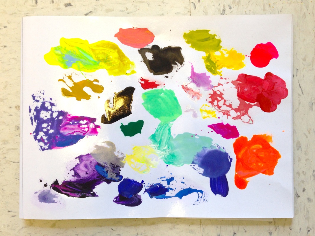
Today's palette comes from the extremely talented Jacquelyn Gleisner. Her work is expansive (30ft.), but approachable. The detail & raucous color make it enjoyable to travel the entire surface of the painting. Included below the sketchbook images, which were made with the palette shown above, is a brief Q&A regarding materials. 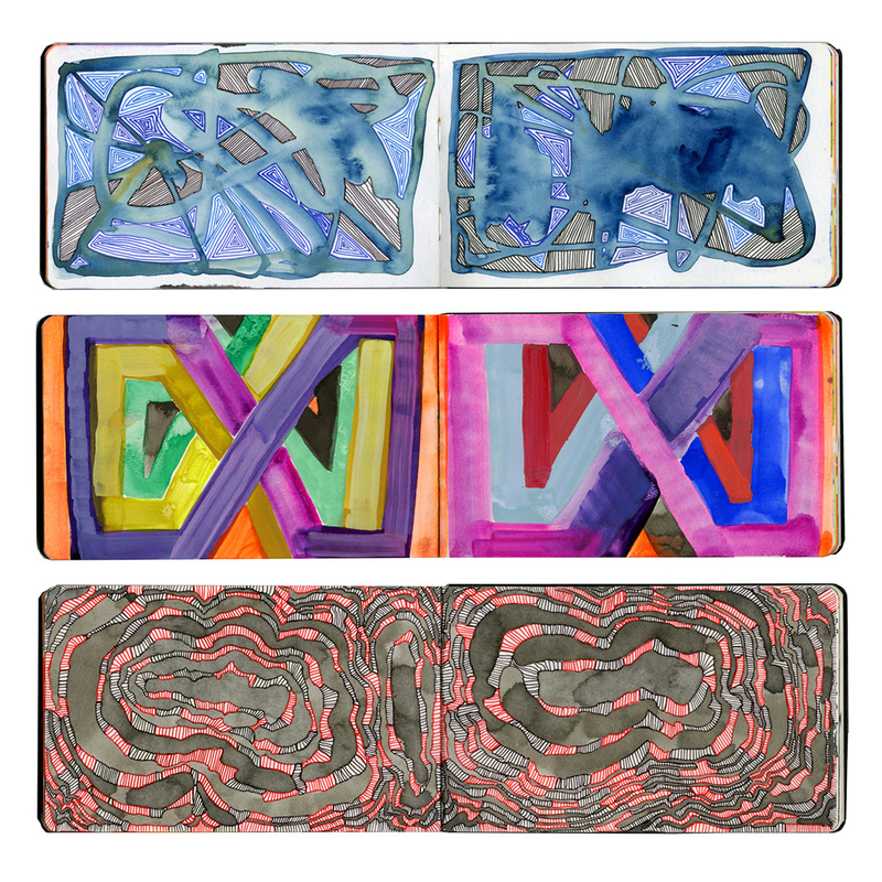
H: What color do you wish wasn't in your palette?
G: Hot pink. I have a problem with neon. H: What is your favorite brush? G: Kolinsky Sable brushes are my absolute fave, especially small liner brushes (size 0 or 2). H: What is your favorite paper/surface to paint on? G: Paper is my favorite surface, but I do enjoy working on canvas treated with Golden absorbent ground or a well-primed panel on occasion. H: What is your favorite color to work with? G: Blue, always blue! I certainly agree with Jacquelyn that blue is the best color to work with! And would encourage you to check out her website for more wonderful art, along with her twitter & instagram. And if you happen to live in the Lancaster, PA area stop by Sunshine Gallery by October 29th, for a real life viewing. 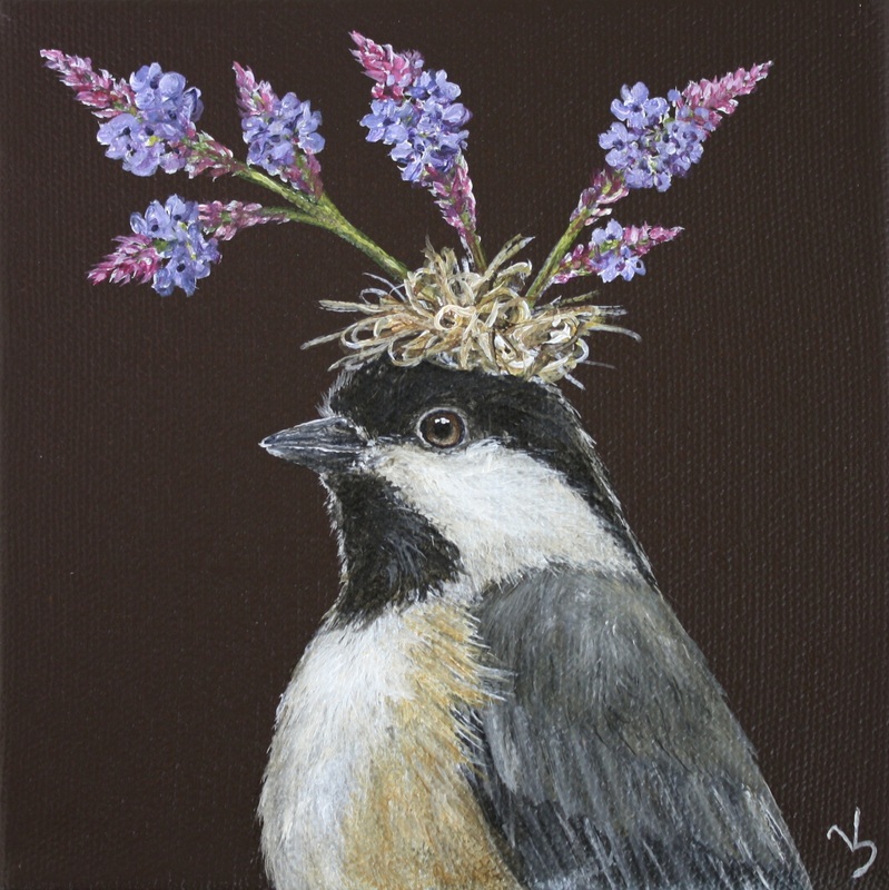 Gabby, chickadee with blue vervain Vicki Sawyer says, "If birds can build nests, they can make hats." And paint hats for them she does. Her paintings always bring a smile to my day with their whimsy, detail, and directness. The photo Vicki included of her palette also shows her painting which I take as a bonus. I had never considered a plate palette, but seeing the results certainly makes that method a contender now. It is great to see how people work & use their palettes. You learn a lot that way, along with asking questions. Included here is a brief Q&A: J: What color do you wish wasn't there? V: Sometimes I wish raw umber was not there, but I use it so much. J: What is your favorite brush? V: I love using brights because they can give you a thin, controlled line or a broad stroke. J: What is your favorite paper/surface to paint on? V: Having sewed a lot, I love the texture of painting on canvas, but since I usually paint highly detailed pieces, I prefer a fine textured canvas. J: What is your favorite color to work with? V: My favorite color to work with is diarylide yellow because it provides a great, enhancing undercoat for the more transparent reds and greens. If you are interested in seeing more of Vicki's work head over to her website where she also has information on her latest shows. She also has a fun zazzle shop full of customizable merchandise. 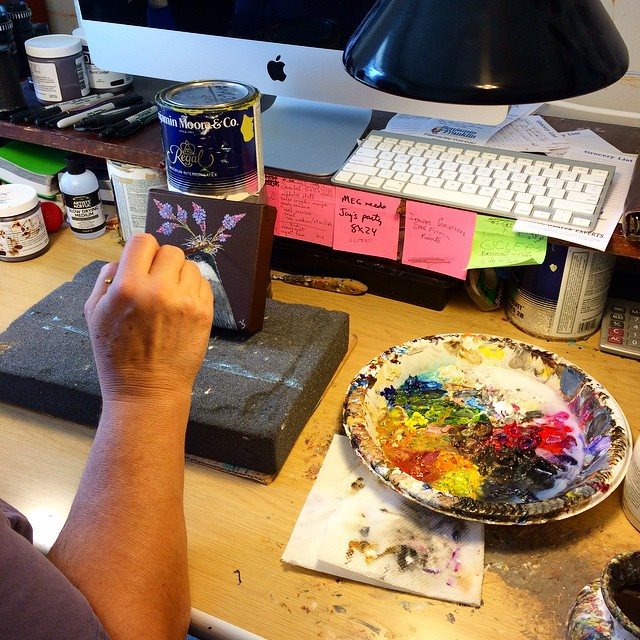 |